Inauguration speeches
Acquiring inauguration speeches
Though not about Greenville especially, it might be interesting to quantitatively analyze inauguration speeches. This analysis will be done using two paradigms: the tm package and the tidytext package. We will read the speeches in such a way that we use the tidytext package; later on we will use some tools from that package to make analyses traditionally done by tm.
I looked around for inauguration speeches, and finally found them at www.bartelby.com. They are in a format more for human consumption, but with the use of the rvest (harvest?) package, we can read them in relatively easily. However, we need to do a mapping from speech IDs to speakers (newly inaugurated presidents), which is a little ugly and tedious.
library(rvest)
library(magrittr)
library(dplyr)
library(readr)
library(tidytext)
library(tm)
library(ggplot2)

# download and format data ------------------------------------------------


fmt_string <- "http://www.bartleby.com/124/pres%d.html"

speakers <- read.csv(textConnection("Number,Speaker
13,George Washington
14,George Washington
15,John Adams
16,Thomas Jefferson
17,Thomas Jefferson
18,James Madison
19,James Madison
20,James Monroe
21,James Monroe
22,John Quincy Adams
23,Andrew Jackson
24,Andrew Jackson
25,Martin Van Buren
26,William Henry Harrison
27,James Knox Polk
28,Zachary Taylor
29,Franklin Pierce
30,James Buchanon
31,Abraham Lincoln
32,Abraham Lincoln
33,Ulysses S. Grant
34,Ulysses S. Grant
35,Rutherford B. Hayes
36,James A. Garfield
37,Grover Cleveland
38,Benjamin Harrison
39,Grover Cleveland
40,William McKinley
41,William McKinley
42,Theodore Roosevelt
43,William Howard Taft
44,Woodrow Wilson
45,Woodrow Wilson
46,Warren G. Harding
47,Calvin Coolidge
48,Herbert Hoover
49,Franklin D. Roosevelt
50,Franklin D. Roosevelt
51,Franklin D. Roosevelt
52,Franklin D. Roosevelt
53,Harry S. Truman
54,Dwight D. Eisenhower
55,Dwight D. Eisenhower
56,John F. Kennedy
57,Lyndon Baines Johnson
58,Richard Milhaus Nixon
59,Richard Milhaus Nixon
60,Jimmy Carter
61,Ronald Reagan
62,Ronald Reagan
63,George H. W. Bush
64,Bill Clinton
65,Bill Clinton
66,George W. Bush
67,George W. Bush
68,Barack Obama
69,Barack Obama
70,Donald Trump"))

# read the speeches into a list of data.frames, append ID number in a new column
speeches <- list()

for (id in 13:70) {
  speech_html <- read_html(sprintf(fmt_string,id))

  speech_lines <- speech_html %>%
    html_nodes("table") %>%
    extract(9) %>%
    html_table() %>%
    as.data.frame() %>%
    rename(text=X1,line=X2) %>%
    mutate(id=rep(id,nrow(.)))

  speeches[[id-12]] <- speech_lines
}

# concatenate all the speeches and add speaker names
speech_df <- do.call(rbind,speeches)

speech_df <- speech_df %>% left_join(speakers,by=c("id"="Number"))
First analysis
Now that we have the speeches as a one-record-per-speech data frame, we can start to analyze them. This post will consist really of a basic analysis based on the “bag of words” paradigm. There are more sophisticated analyses that can be done, but even the basics can be interesting. First, we do a bit of data munging to create a one-record-per-word-per-speech dataset. The strategy is based on the tidy text paradigm described here. Once we have the dataset in the format we want, we can easily eliminate “uninteresting” words by using a filtering anti-join from the dplyr package. (Note: there may be analyses where you would want to keep these so-called “stop-words”, e.g. “a” and “the”, but for purposes here we just get rid of them.)
speech_words <- speech_df %>%
  mutate(id=factor(id)) %>%
  unnest_tokens(word,text) %>%
  count(id, word, sort = TRUE) %>%
  ungroup()
total_words <- speech_words %>%
  group_by(id) %>%
  summarize(total = sum(n))

speech_words <- left_join(speech_words, total_words) %>%
  anti_join(stop_words %>% filter(lexicon=="onix") %>%
              select(-lexicon) %>%
              union(data.frame(word=c("s","so"))),by="word")
## Joining, by = "id"## Warning in union_data_frame(x, y): joining character vector and factor,
## coercing into character vectorspeech_words %>% head()## # A tibble: 6 × 4
## id word n total
## <fctr> <chr> <int> <int>
## 1 26 power 47 8463
## 2 21 power 11 4476
## 3 29 power 11 3341
## 4 27 power 9 4813
## 5 36 power 9 2990
## 6 25 power 8 3902We can now plot the most common words in inauguration speech, just to dig into what that dataset looks like. Note that I polished this graph up a bit (changing axis labels to something pretty, rotating x-axis labels, etc.), but the first past through this graph was a bit ugly. To me, the two most important elements of this graph are selecting the 20 most common words and re-ordering from most to fewest.
# find frequencies of words used in speeches
# we do this so we can reorder in ggplot2 (there may be a way to do directly in ggplot2 without this step)
speech_freq <- speech_words %>%
  group_by(word) %>%
  summarize(frequency=n()) %>%
  arrange(desc(frequency))

# plot frequencies of words over all speeches, top 20 only, in order of frequency most to fewest
ggplot(speech_freq %>% ungroup() %>% slice(1:20), aes(reorder(word,desc(frequency)))) +
  geom_bar(aes(y=frequency),stat="identity",alpha = 0.8, show.legend = FALSE) +
  labs(title = "Term Frequency Distribution in Presidential Inaugural Addresses") +
    xlab("Word") + ylab("Frequency") + theme(axis.text.x = element_text(angle = 45, hjust = 1))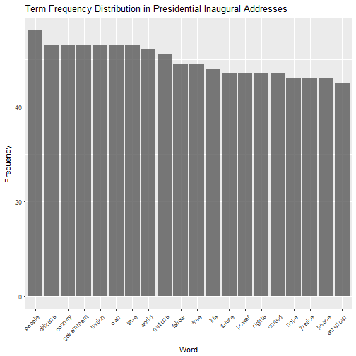
What makes speeches unique
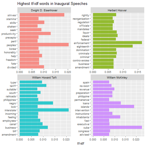
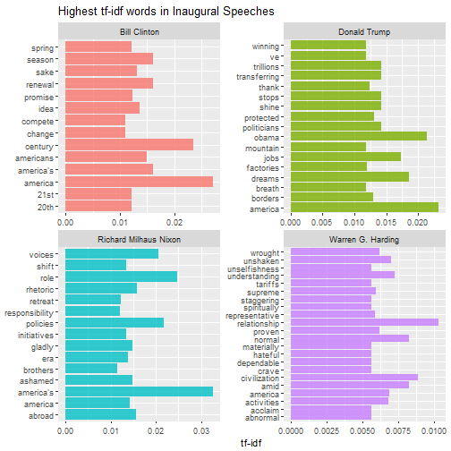
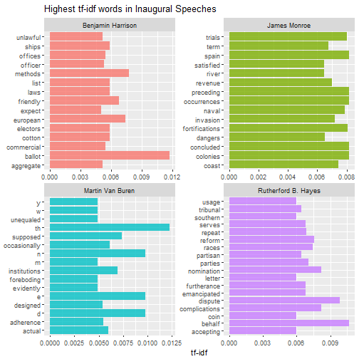
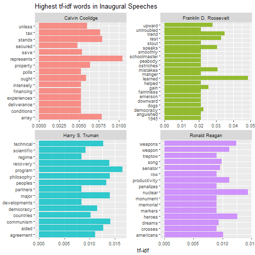
At least using the bag-of-words paradigm, the term-frequency * inverse-document-frequency (TF-IDF) analysis is used to determine what words set speeches (or other documents) apart from each other. A word in a given document has a high TF-IDF score if it appears very often in that speech, but rarely in others. If a word appears less frequently in a speech, or appears more often in other speeches, that will lower the TF-IDF score. Thus, a word with a high TF-IDF score can be considered a signature word for a speech Using this strategy for all interesting words, we can compare styles of speeches, and even cluster them into groups.
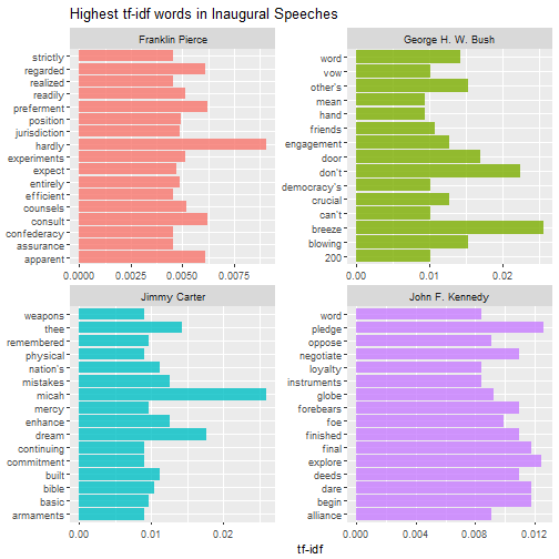
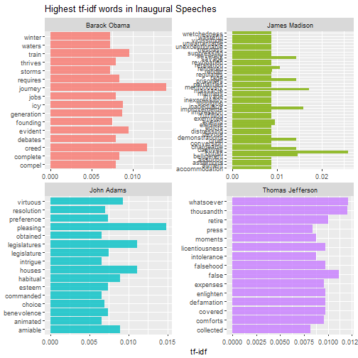
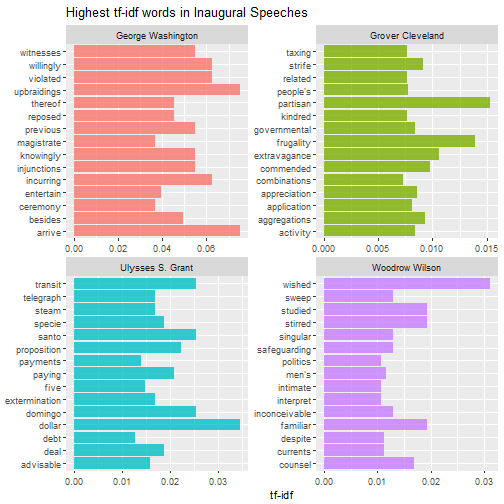
First, we use the bind_tf_idf function from tidytext to calculate the TF-IDF score. Then we can find the words with the highest TF-IDF score - the words that do the most to distinguish one inauguration speech from another.
speech_words2 <- speech_words %>%
  bind_tf_idf(word, id, n)
speech_words2
## # A tibble: 34,734 × 7
## id word n total tf idf tf_idf
## <fctr> <chr> <int> <int> <dbl> <dbl> <dbl>
## 1 26 power 47 8463 0.015254787 0.2102954 0.0032080118
## 2 21 power 11 4476 0.006654567 0.2102954 0.0013994250
## 3 29 power 11 3341 0.008403361 0.2102954 0.0017671883
## 4 27 power 9 4813 0.004729375 0.2102954 0.0009945658
## 5 36 power 9 2990 0.007419621 0.2102954 0.0015603122
## 6 25 power 8 3902 0.004839685 0.2102954 0.0010177636
## 7 30 power 7 2834 0.006178288 0.2102954 0.0012992655
## 8 50 power 7 1823 0.009681881 0.2102954 0.0020360551
## 9 38 power 6 4397 0.003472222 0.2102954 0.0007301924
## [ reached getOption("max.print") -- omitted 1 row ]
## # ... with 34,724 more rowsspeech_words2 %>%
select(-total) %>%
arrange(desc(tf_idf))## # A tibble: 34,734 × 6
## id word n tf idf tf_idf
## <fctr> <chr> <int> <dbl> <dbl> <dbl>
## 1 14 arrive 1 0.01851852 4.060443 0.07519339
## 2 14 upbraidings 1 0.01851852 4.060443 0.07519339
## 3 14 incurring 1 0.01851852 3.367296 0.06235733
## 4 14 violated 1 0.01851852 3.367296 0.06235733
## 5 14 willingly 1 0.01851852 3.367296 0.06235733
## 6 14 injunctions 1 0.01851852 2.961831 0.05484872
## 7 14 knowingly 1 0.01851852 2.961831 0.05484872
## 8 14 previous 1 0.01851852 2.961831 0.05484872
## 9 14 witnesses 1 0.01851852 2.961831 0.05484872
## 10 14 besides 1 0.01851852 2.674149 0.04952127
## # ... with 34,724 more rowsplot_inaug <- speech_words2 %>%
arrange(desc(tf_idf)) %>%
mutate(word = factor(word, levels = rev(unique(word)))) %>%
left_join(speakers %>% mutate(id=factor(Number)),by="id")
ggplot(plot_inaug %>% filter(tf_idf > 0.025), aes(word, tf_idf, fill = Speaker)) +
geom_bar(alpha = 0.8, stat = "identity") +
labs(title = "Highest tf-idf words in Presidential Inauguration Speeches",
x = NULL, y = "tf-idf") +
coord_flip()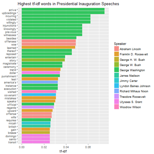
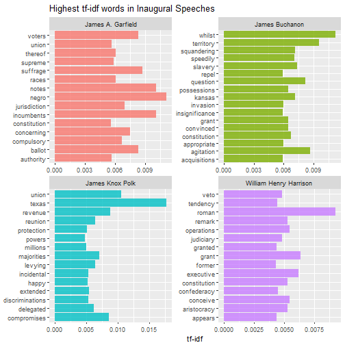
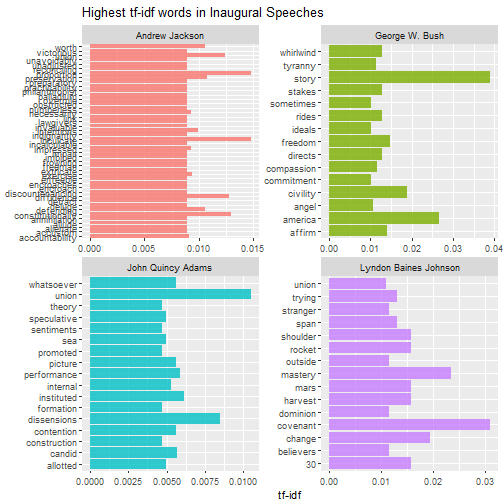
Then we can do this analysis within each speech to find out what distinguishes them from other speeches. The for loop below can be used to print multiple pages of faceted graphs, good for when you are using RStudio or the R gui to explore.
plot_words <- speech_words2 %>%
  left_join(speakers %>% mutate(id=factor(Number)),by="id") %>%
  group_by(Speaker) %>%
  top_n(15,tf_idf)


speakers_vec <- unique(plot_words$Speaker)
n_panel <- 4
for (i in 1:floor(length(speakers_vec)/n_panel)) {
  these_speakers <- speakers_vec[((i-1)*n_panel+1):min(i*n_panel,length(speakers_vec))]
  this_plot <- ggplot(plot_words %>% filter(Speaker %in% these_speakers), aes(word, tf_idf, fill = Speaker)) +
    geom_bar(alpha = 0.8, stat = "identity", show.legend = FALSE) +
    labs(title = "Highest tf-idf words in Inaugural Speeches",
         x = NULL, y = "tf-idf") +
    facet_wrap(~Speaker, ncol = 2, scales = "free") +
    coord_flip()
  print(this_plot)
}
Which speeches are most like each other?
There’s a lot more that can be done here, but we’ll move on to clustering these inauguration speeches. This will require the use of the document-term matrix, which is a matrix that has documents in the rows, words in the columns, and entries that represent the frequency within the row’s document of the column’s term. The tidytext packages uses the cast_dtm function to create the document-term matrix, and the output can then be used by the tm package and other R commands for analysis.
plot_words_dtm <- speech_words %>%
  left_join(speakers %>% mutate(id=factor(Number)),by="id") %>%
  cast_dtm(id,word,n)

plot_words_dtm <- removeSparseTerms(plot_words_dtm,0.1)
plot_words_matrix <- as.matrix(plot_words_dtm)
To show the hierarchical clustering analysis, we can simply compute a distance matrix, which can be fed into hclust:
dist_matrix <- dist(scale(plot_words_matrix),method="euclidean")
inaug_clust <- hclust(dist_matrix,method="ward.D")
plot(inaug_clust)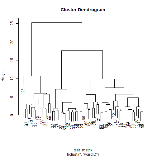
It’s pretty interesting that Speech 26 is unlike nearly all the others. This was William Henry Harrison discussing something about the Roman aristocracy, something other presidents have not felt the need to do very much.
Let’s say we want to break these speeches into a given number of clusters. We can use the k-means approach.
inaug_km <- kmeans(plot_words_matrix,centers = 5,nstart = 25)

for (i in 1:length(inaug_km$withinss)) {
  #For each cluster, this defines the documents in that cluster
  inGroup <- which(inaug_km$cluster==i)
  within <- plot_words_dtm[inGroup,]
  if(length(inGroup)==1) within <- t(as.matrix(within))
  out <- plot_words_dtm[-inGroup,]
  words <- apply(within,2,mean) - apply(out,2,mean) #Take the difference in means for each term
  print(c("Cluster", i), quote=F)
  labels <- order(words, decreasing=T)[1:20] #Take the top 20 Labels
  print(names(words)[labels], quote=F) #From here down just labels
  if(i==length(inaug_km$withinss)) {
    print("Cluster Membership")
    print(table(inaug_km$cluster))
    print("Within cluster sum of squares by cluster")
    print(inaug_km$withinss)
  }
}
## [1] Cluster 1
## [1] people government country own citizens time
## [7] nation <NA> <NA> <NA> <NA> <NA>
## [13] <NA> <NA> <NA> <NA> <NA> <NA>
## [19] <NA> <NA>
## [1] Cluster 2
## [1] government people citizens time country nation
## [7] own <NA> <NA> <NA> <NA> <NA>
## [13] <NA> <NA> <NA> <NA> <NA> <NA>
## [19] <NA> <NA>
## [1] Cluster 3
## [1] nation time own people citizens country
## [7] government <NA> <NA> <NA> <NA> <NA>
## [13] <NA> <NA> <NA> <NA> <NA> <NA>
## [19] <NA> <NA>
## [1] Cluster 4
## [1] citizens country own nation time government
## [7] people <NA> <NA> <NA> <NA> <NA>
## [13] <NA> <NA> <NA> <NA> <NA> <NA>
## [19] <NA> <NA>
## [1] Cluster 5
## [1] government people citizens country own nation
## [7] time <NA> <NA> <NA> <NA> <NA>
## [13] <NA> <NA> <NA> <NA> <NA> <NA>
## [19] <NA> <NA>
## [1] "Cluster Membership"
##
## 1 2 3 4 5
## 8 12 19 16 3
## [1] "Within cluster sum of squares by cluster"
## [1] 760.3750 954.5833 1147.1579 733.8125 797.3333Membership of speeches in clusters is here:
inaug_km$cluster## 13 14 15 16 17 18 19 20 21 22 23 24 25 26 27 28 29 30 31 32 33 34 35 36 37
## 4 4 1 4 4 4 4 2 2 2 4 2 1 5 5 4 3 2 1 4 4 4 2 1 2
## 38 39 40 41 42 43 44 45 46 47 48 49 50 51 52 53 54 55 56 57 58 59 60 61 62
## 1 1 1 2 4 2 4 3 3 1 5 3 2 3 4 3 3 3 4 3 3 3 3 2 2
## 63 64 65 66 67 68 69 70
## 3 3 3 4 3 3 3 3It’s interesting to note that all of the speeches since Hoover (i.e. 49 through 70) have either been either in category 1 or 5, with the latest ones being in Cluster 1 (this includes Reagan, Bush, Clinton, Bush, Obama, and Trump). Nearly all speeches discuss the relationship between government and its people (as you would expect from an inauguration speech), but Cluster 5 seems to put more emphasis on people, and Cluster 1 on government. Hmmm…
Of course, you can probably get something different with fewer clusters, and you can use the hierarchical clustering analysis above to justify a different number of clusters.
Sentiment analysis
We return to the bag-of-words tidytext paradigm to do a sentiment analysis. The sentiment analysis we do here is very simple (perhaps oversimplified), and tidytext supports more sophisticated analysis. But this is a start. We start by going back to the one-record-per-speech data frame, and scoring words based on sentiment. We don’t worry about stop words at this point, because they will likely be scored as 0 anyway. We use the Bing sentiment list, which basically scores words as positive or negative (or nothing). We assign a score that basically gives a +1 to positive and -1 to negative. Then we add up the score column, and divide by the number of words in the speech. (Which is why we did not eliminate stop words here.) This gives a sort of average positivity/negativity score per word in the speech. If the score is negative, there are more negative words in the speech than positive. If the score is positive, there are more positive words. The higher the absolute value of the score, the higher the imbalance in positive/negative words. Similarly, we just count the number of sentiment words (whether positive or negative) to get an idea of the emotional content of the speech. (Note: this is a preliminary analysis. This does not distinguish between, say, “good” and “not good”. So take any individual results with a grain of salt and dig deeper.)
sw_sent <- speech_df %>%
  mutate(id=factor(id)) %>%
  unnest_tokens(word,text) %>%
  inner_join(get_sentiments("bing")) %>%
  mutate(score=(sentiment=="positive")-(sentiment=="negative"),is_scored=ifelse(sentiment %in% c("positive","negative"),1,0))
## Joining, by = "word"sw_sent %>%
group_by(Speaker,id) %>%
summarize(speech_score=sum(score),speech_sent_words=sum(is_scored)) %>%
left_join(total_words,by="id") %>%
mutate(speech_score=speech_score/total,speech_sent_words=speech_sent_words/total) %>%
arrange(speech_score) %>%
print(n=nrow(.))## Source: local data frame [58 x 5]
## Groups: Speaker [39]
##
## Speaker id speech_score speech_sent_words total
## <fctr> <fctr> <dbl> <dbl> <int>
## 1 Abraham Lincoln 32 0.001426534 0.07275321 701
## 2 Abraham Lincoln 31 0.002199615 0.06983778 3637
## 3 James Madison 19 0.010734930 0.09331131 1211
## 4 John F. Kennedy 56 0.010989011 0.10036630 1365
## 5 Franklin D. Roosevelt 50 0.011519473 0.08831596 1823
## 6 Woodrow Wilson 44 0.011716462 0.08787346 1707
## 7 Franklin D. Roosevelt 49 0.012227539 0.09409888 1881
## 8 William Henry Harrison 26 0.013115916 0.06865178 8463
## 9 Franklin D. Roosevelt 51 0.015613383 0.06022305 1345
## 10 Andrew Jackson 24 0.016992353 0.07306712 1177
## 11 Barack Obama 68 0.017827529 0.08499171 2412
## 12 Martin Van Buren 25 0.018452076 0.08867248 3902
## 13 Ronald Reagan 61 0.018457752 0.07752256 2438
## 14 Thomas Jefferson 17 0.019852262 0.07710065 2166
## [ reached getOption("max.print") -- omitted 44 rows ]Grover Cleveland and James Madison had the speeches with the highest emotional content, followed by Jimmy Carter and George W. Bush. Wilson, Franklin D. Roosevelt, and George Washington had the lowest emotional content. Abraham Lincoln (in 1860) had the speech with the least positive content (all speeches were positive on balance). William Henry Harrison’s odd speech about the Romans had near the least emotional content, and was one of the least positive speeches.
Conclusion
This analysis of inauguration speeches comes at a time where the change of US presidential power has a different feel, even the inauguration speech. The preliminary analysis above shows that Trump’s speech was similar in topics to speeches for the last 40 or so years, and nothing notable in its emotional content.
This first start revealed a few interesting patterns, but a more sophisticated analysis might reveal something further.